 The colourful Dissociative Initiative Logo was developed when several of us were working on starting up the support group Bridges. I (Sarah) created a fern image in consultation with the Hearing Voices group Sound Minds for their flyers, and I wanted to make something for the Bridges flyers.
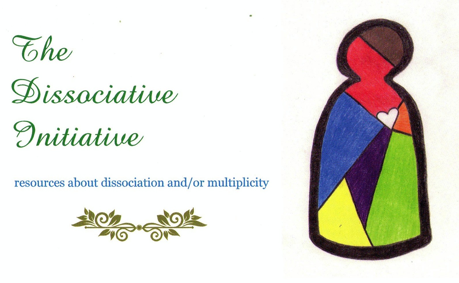
I trialled several different designs. I wanted something striking but simple, that would work big on a flyer or really small on a business card. Dissociation is difficult to communicate visually, so I was looking at visual representations of multiplicity because these can be someone’s personal experience of parts, but are also a lovely metaphor for the coming together of diverse people in the Dissociative Initiative. Many people like the image of a jigsaw puzzle for multiplicity, which I understand, but as it is also used to represent autism I thought I would keep looking. I love rainbows as a representation of diversity and acceptance, of not having to change who you are to be accepted, but rather the differences between us creating a beautiful harmony when we pull together, but as rainbows are used to represent GLBTIQ communities I wanted to do something a little different there too. It was very important for me that the image also be gender-neutral and race-neutral.
I trialled patchwork designs, and various natural images of parts that also form a whole – such as the petals of a flower, or leaves on a tree, but none of them were quite right.
In the end I created this logo, called “The Undivided Heart”. It is modeled on a stained glass window design and uses rainbow colours to represent different parts of a community, who all come together with one heart, a shared purpose – in this case to raise awareness and support people who experience dissociation. As different as we may be in so many ways, we are united by a passion for mental health and a belief that people deserve resources and community.
